
2023 - Present
Role: Solo product designer
ARTbnk (Stakeholder), Grace Cassels (Manager), Sagar, Piyush, Vipin, Mohan, Himanshu (Engineer)
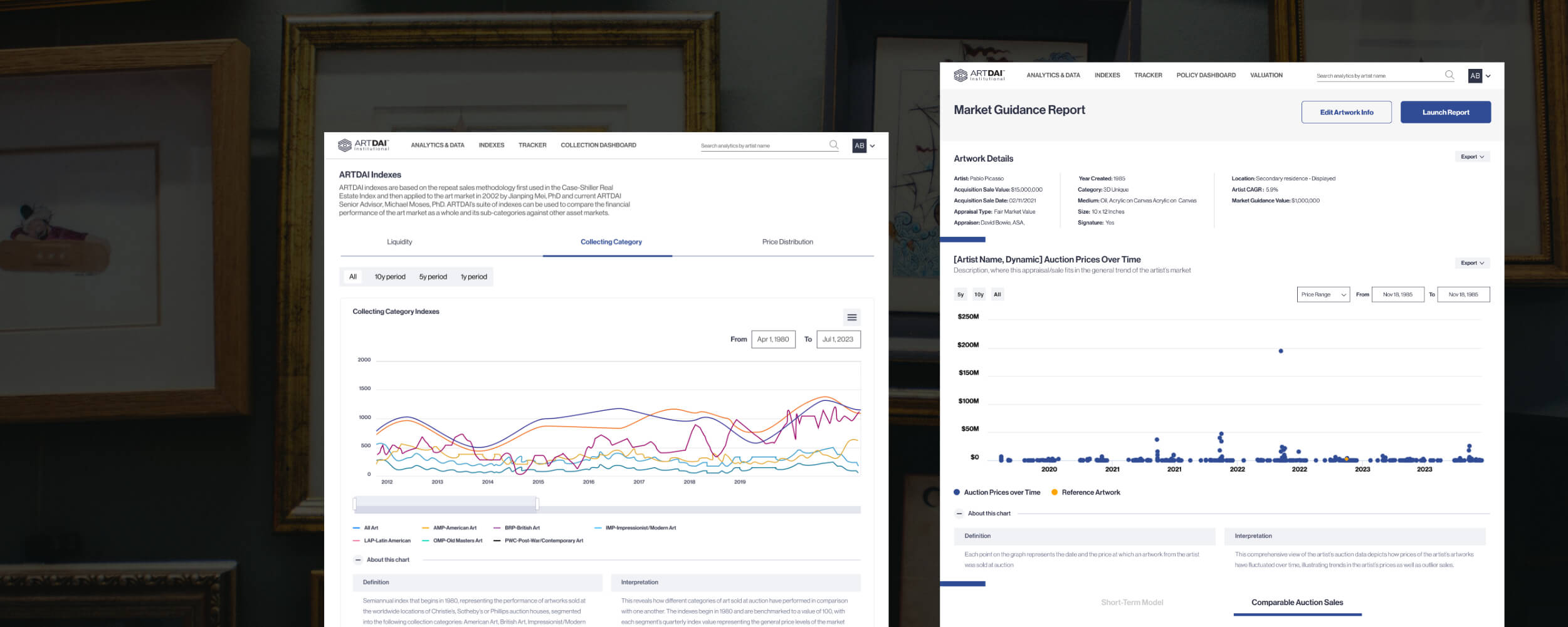
ArtBnk is the industry leader in delivering unbiased, data-driven research and insights from fine art transactions worldwide. With millions of data points on the art market, ArtBnk equips professionals, collectors, and institutions with cutting-edge analytics to make more informed decisions.
The Art Comparables Tool is a core feature of ArtBnk’s platform, used extensively by art professionals, collectors, and institutions to evaluate and compare artworks. The goal of this project was to enhance the user experience for ArtBnk's B2B partners by designing the Art Comparables Tool to:
Based on the research and analytics conducted on ArtBnk's B2B users, the design requirements were straightforward but critical to ensuring usability. Insights revealed that the majority of our b2b & b2c users accessed the platform on systems with a resolution of 1280 x 760, and from our meetings with them they explicitly expressed the need for core comparison data to be visible within their primary screen viewport at a single glance.
Building the Art Comparables Tool required balancing technical feasibility with user needs. My understanding of how front-end code works played a vital role in designing a solution that was not only visually appealing but also practical to implement. It was important to strike a balance between what could be built quickly and efficiently
To effectively plan the layout of the comparables page, I began with wireframes to map out the structure and flow. The wireframes focused on:
To enhance clarity, I categorized the interface elements using a color-coded system:
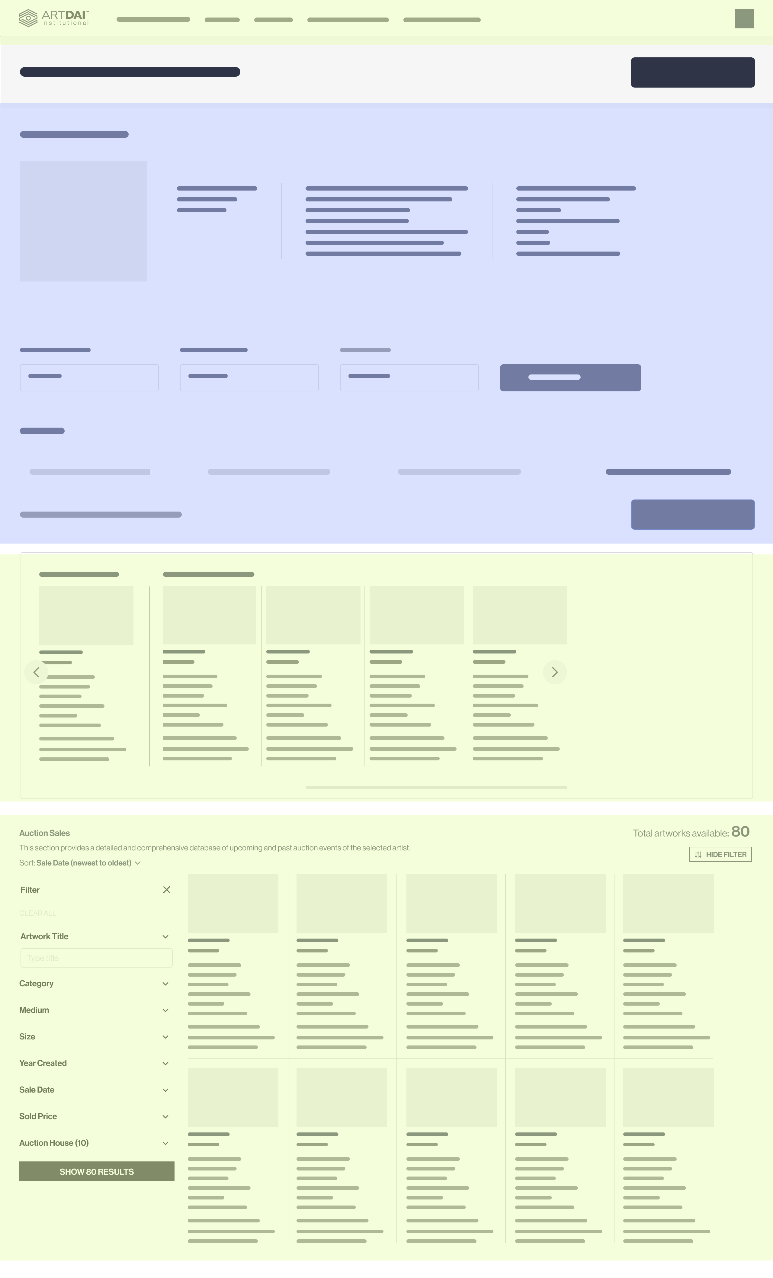
Building on the wireframe design, the next step was to categorize how users would visualize the most important content within their screen’s viewport. Based on our research, the majority of users accessed the platform on systems with a resolution of 1280 x 800, so the design had to prioritize essential information within this frame.
The wireframe included a red-colored section to represent the boundaries of the 1280 x 800 resolution, ensuring the design stayed within the users’ viewport. Within this frame, green sections highlighted high-priority content that needed to remain visible, such as key comparison data.
By mapping the layout in this way, i would be able to aligne the design with user preferences and tailoring it to their screen size and workflow.
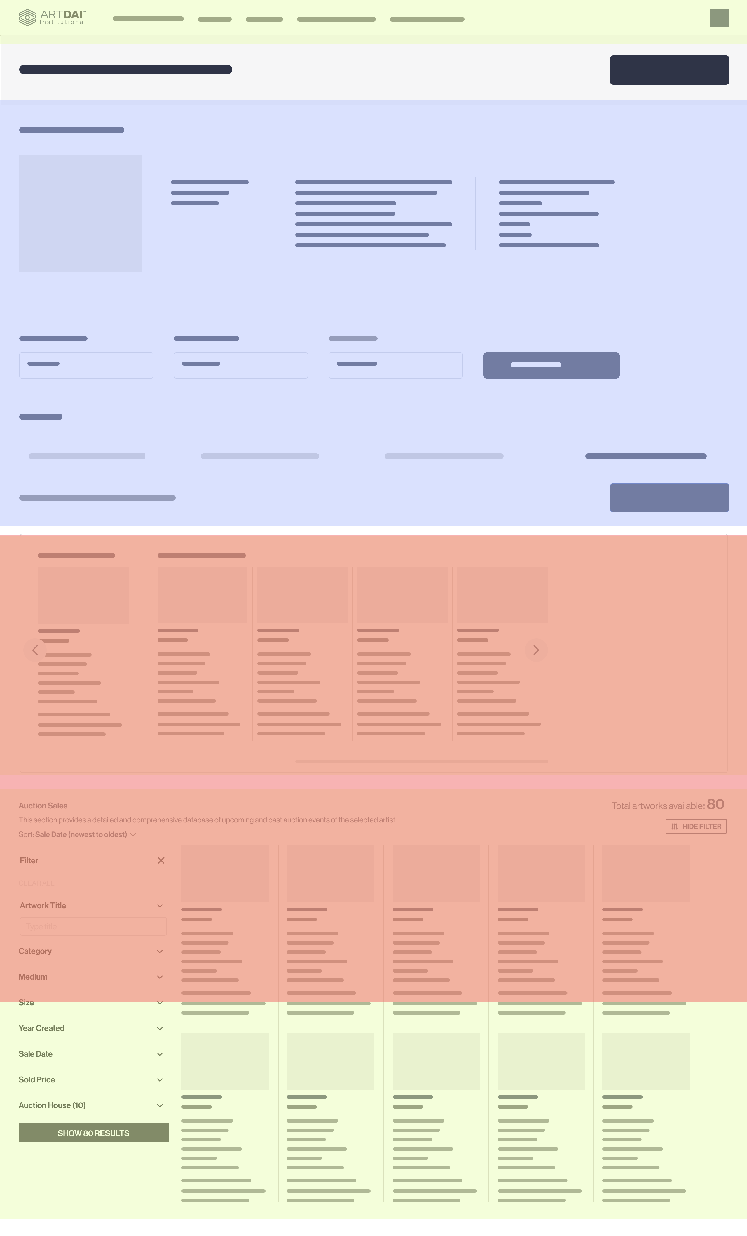
To ensure more green-section content (high-priority information) fit within the targeted red-section viewport (1280 x 800 resolution), I employed disclosure management in the UI design. This approach selectively reveals or hides content based on user interaction, optimizing the presentation of information without overwhelming the user.
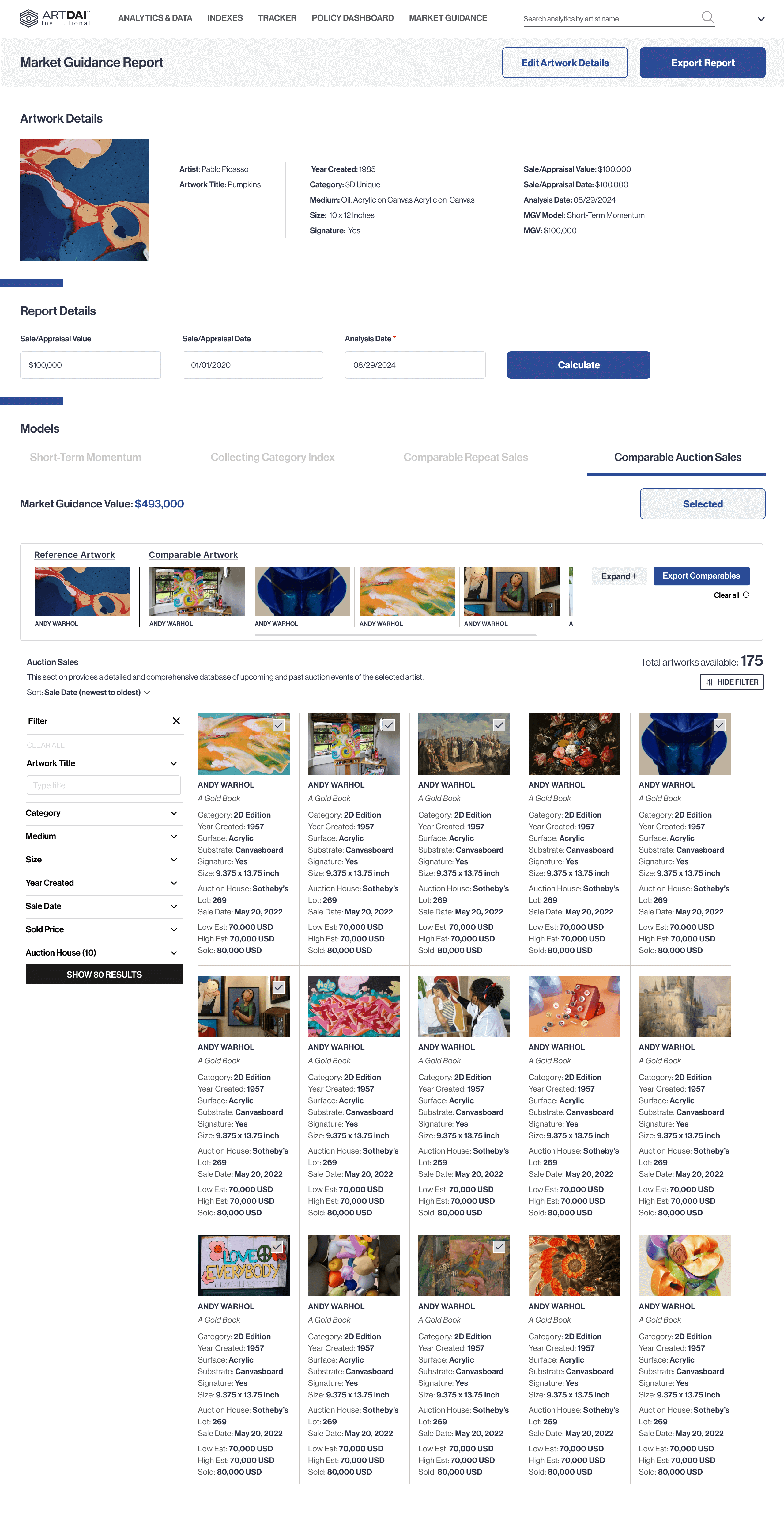
In the wireframe, this is reflected through an expand/collapse feature triggered by a strategically placed CTA button. This design allowed users to bring additional content into the desired viewport as needed, maintaining focus on critical data while providing the flexibility to access more details seamlessly.
By integrating disclosure management, the UI became more adaptable and efficient, ensuring essential information was easily accessible within the users’ limited screen space.
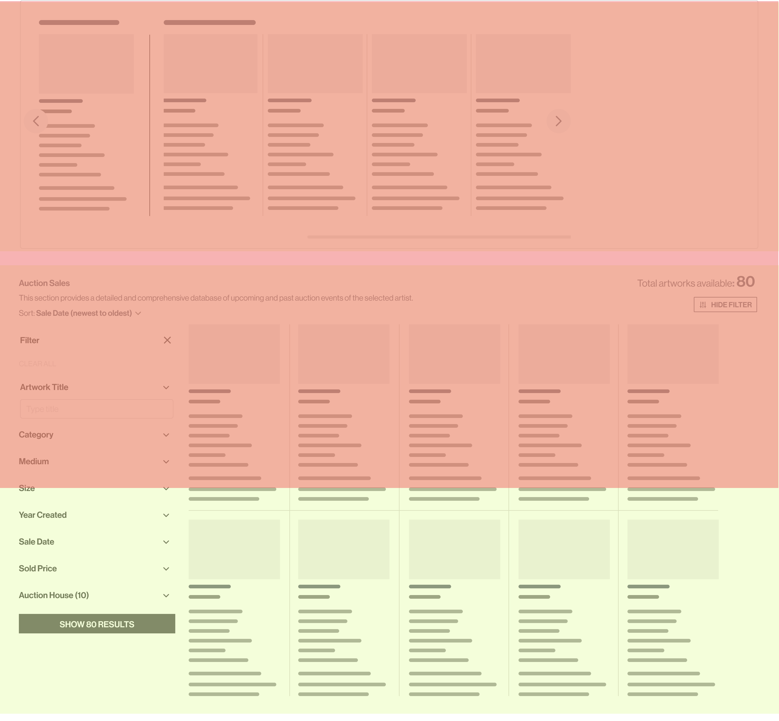
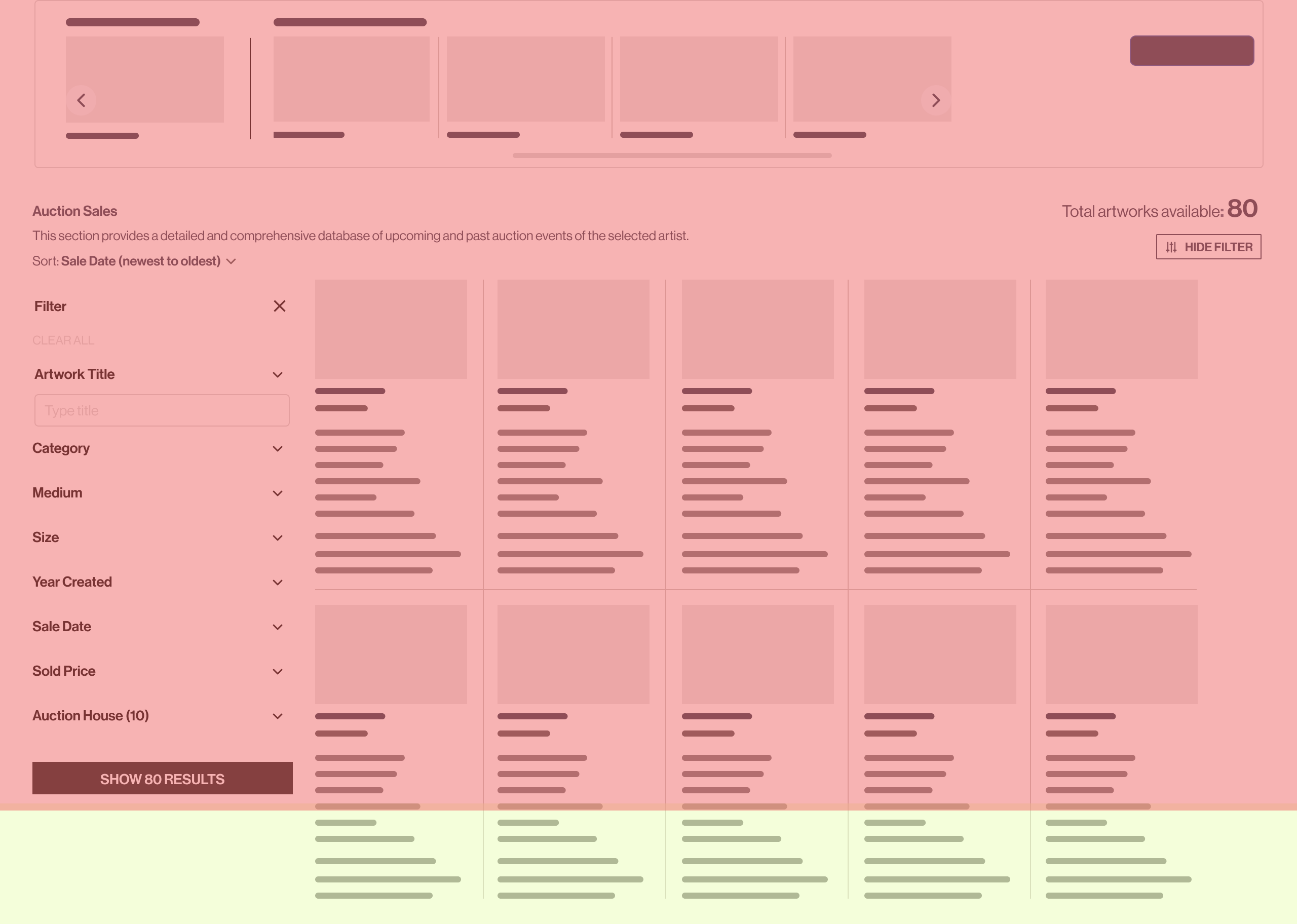
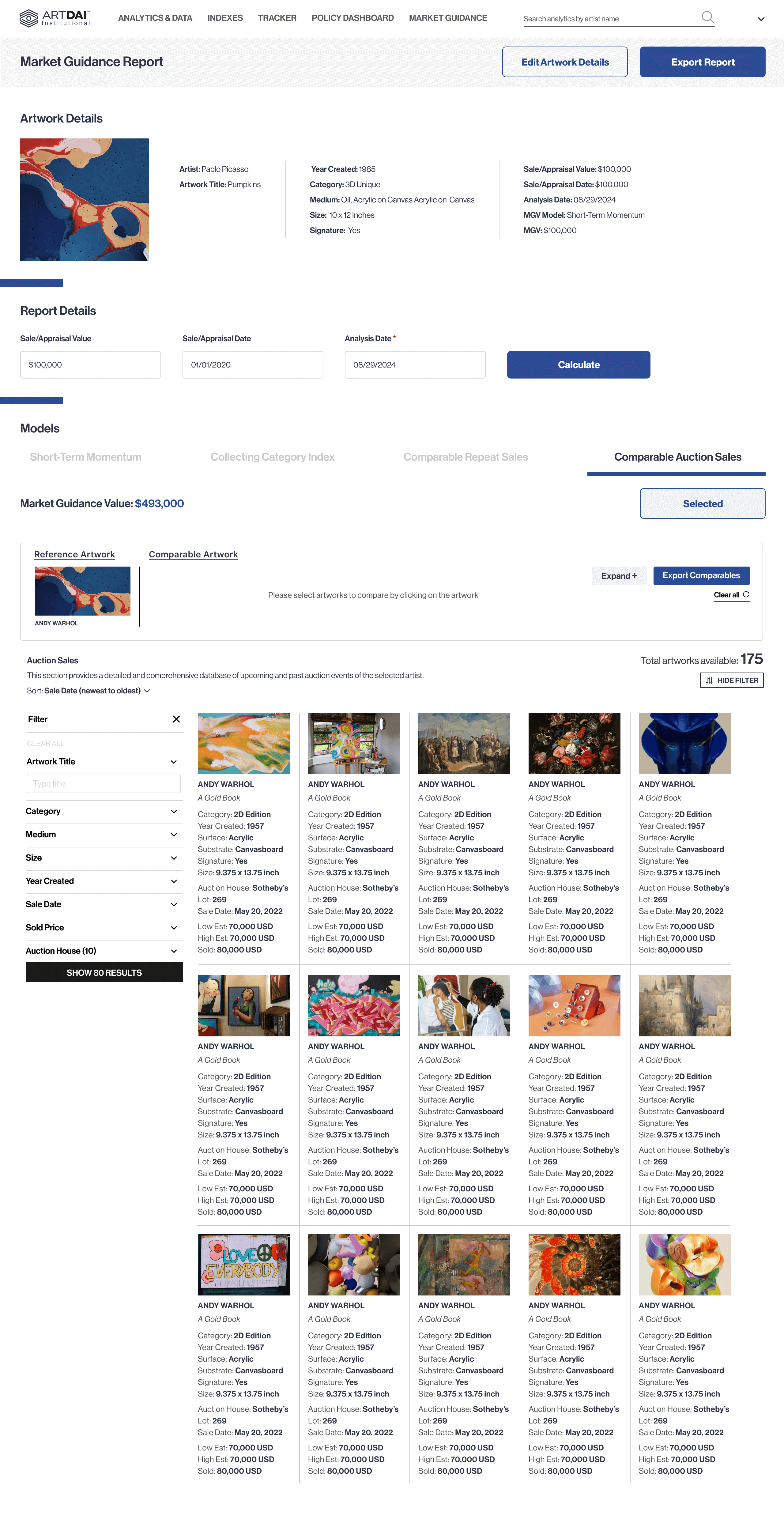
The high-fidelity prototype brought the vision to reality, showing how the key content fits seamlessly within our researched users' targeted 1280*800 resolution. By using disclosure UI principles, we ensured that essential information was prioritized and easy to access, without overwhelming the interface.
