
2022 (6 Month)
Role: Solo product designer
Rajesh, Arun, Oluwaseun (Stakeholder)
Contribution: UI design, UX research, Product strategy, Competitive analysis
In an era where healthcare accessibility is more crucial than ever, millions face significant barriers to basic medical services. Our research revealed several critical pain points:
These telehealth trends are forecasted to lead to a more decentralized healthcare system, resulting in large hospitals offering a wider variety of services in more locations or completely remotely. This hybrid approach will offer an increase in access to care, enhance affordability and generates potential for better outcomes
The global telehealth market was estimated at USD 41 billion in 2021 and expected to reach USD 224.8 billion by 2030 and poised to grow at a compound annual growth rate (CAGR) of 18.8% during the forecast period 2022 to 2030. According to Precedence Research

The solution is to build a mobile and web app that allows patients to easily access healthcare services in the comfort of their homes, office and co. This helps to save time and money, users can browse through the ariels of medical specialists, offer seamless payment to doctors, hospitals and labs, schedule/book lab tests online and shop for their medicines and also improve follow-up appointments care, offering patients convenience and accessibility of telehealth.
In an era where healthcare accessibility is more crucial than ever, millions face significant barriers to basic medical services. Our research revealed several critical pain points:
To better understand the needs of the healthcare practitioners, patients and their pain points. I started the research by having a conversation with medical practitioners to have a better understanding of their views, experiences, perceptions, and attitudes towards teleconsultations.
During the interview/chat with medical practitioners and People, I understand a couple of benefits the app will provide to patients. Telehealth app is an enthusiastic way to offer care and reduce the impact of self-medication. It will help ease the burden on in-house consultation by aiding doctor help patients that are aware of their symptoms and unambiguously present them as much as possible.
According to market research & findings
Every time a patient walks into their doctor's office, there is a 75% chance that they could have stayed at home. One hospital report says it saves a considerable amount of money every time a telehealth app is used over an in-person visit to ER.
Primary users: Adults aged 18-75
High familiarity with mobile apps and digital services
Lifestyle: Busy professionals, parents, and students with limited time for traditional healthcare visits
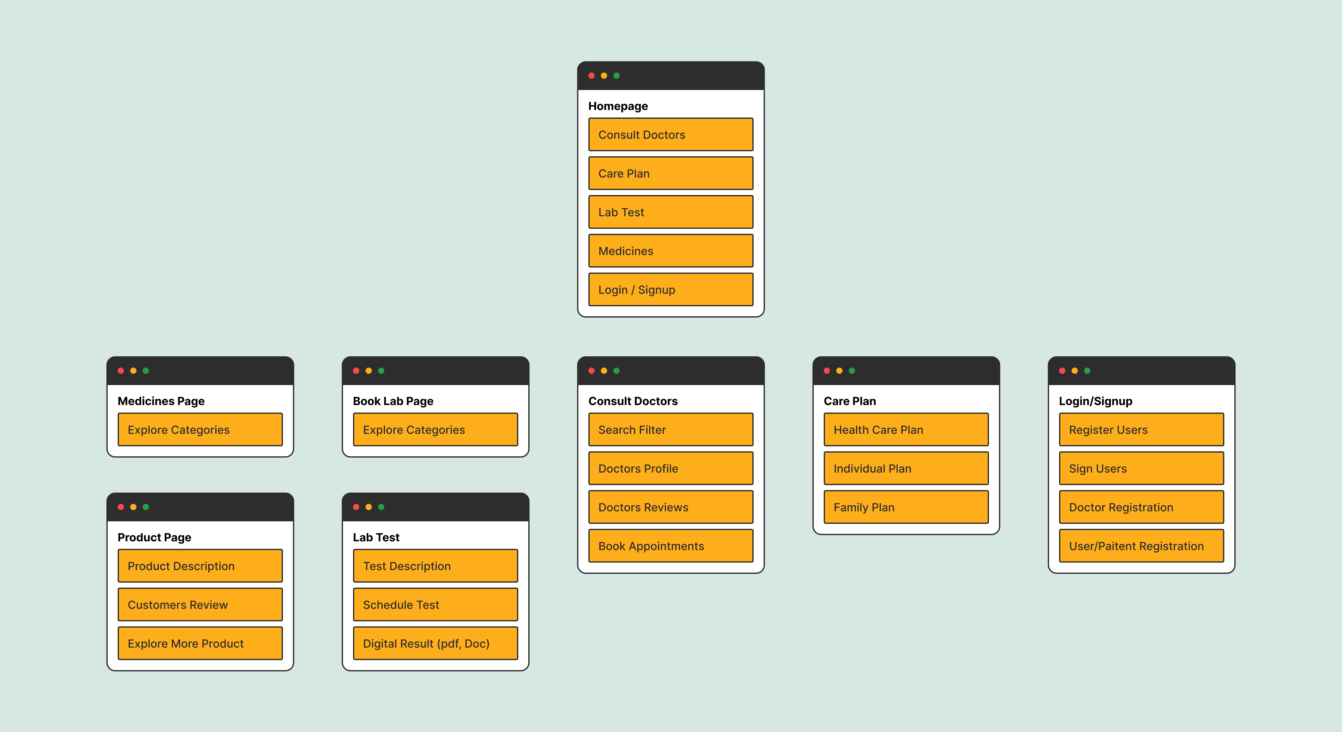
To help me visualize and identify all the features and categories in a complicated attempt at site hierarchy and organization to provide users with an enjoyable experience on the website and mobile.
I used clean and friendly typeface for the visual appeal of healthgenix. Bold and ease to read font weight to highlight important information
To make the web and mobile app pop. I choose bold colours to draw attention and light colours to complement them.
Starting with the homepage and Pharmacy page of healthgenix some of the key objectives was to educate users (patients) with clear and concise messaging, a flexible web design that is helpful, clear, and user-friendly and the process of updating the website is simple and adaptive to business needs.
The ability to find and access content across a sundry of services offered in the healthcare sector is the pivot to the success of any telehealth platform. My design approach delivers here by simplifying the user experience. Easy to find and use the search bar and offered services, health article section to educate users efficiently and effectively, easy to navigate user interface, Clean, sleek typography, images and video are paired with minimal designs to better user interactions.


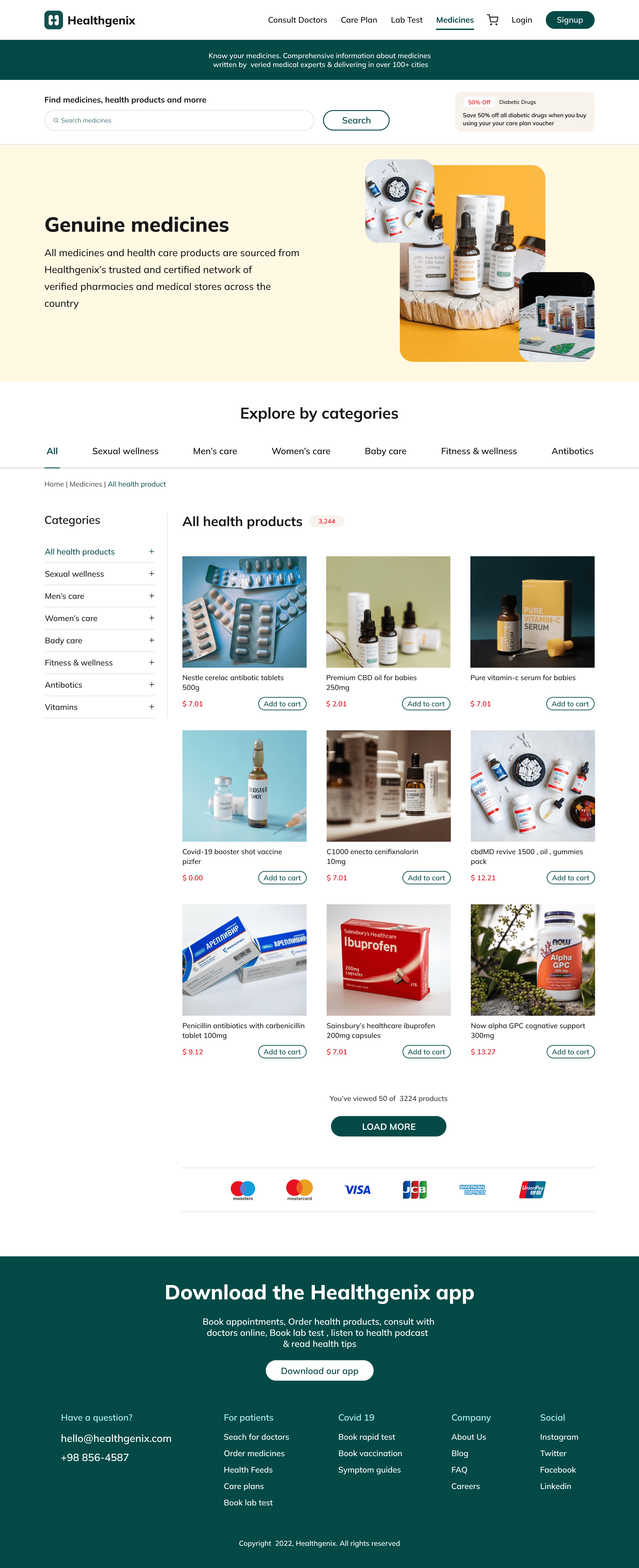
The pharmacy page contains a large number of products. The design approach here is to use the filter element. The purpose of the filters is to allow users to remove products that are of no importance to them, Which leads to a more personalized experience.
The user experience encourages users to select the category for better search results and rearrange the filter based on importance so, that they can find their desired product without long scrolling. Helping users by showing search suggestions to reduce the effort of typing and the chance of misspelling.

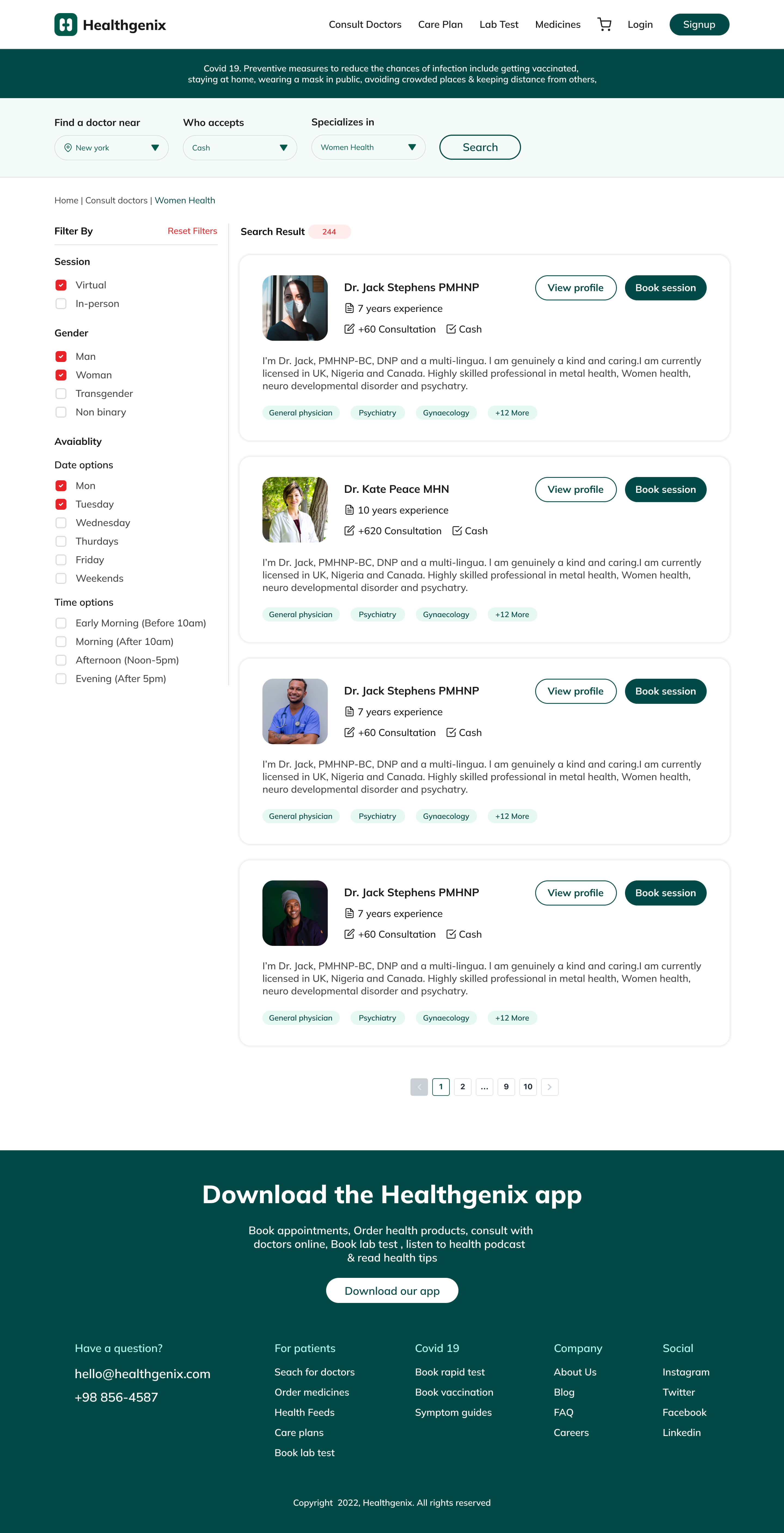
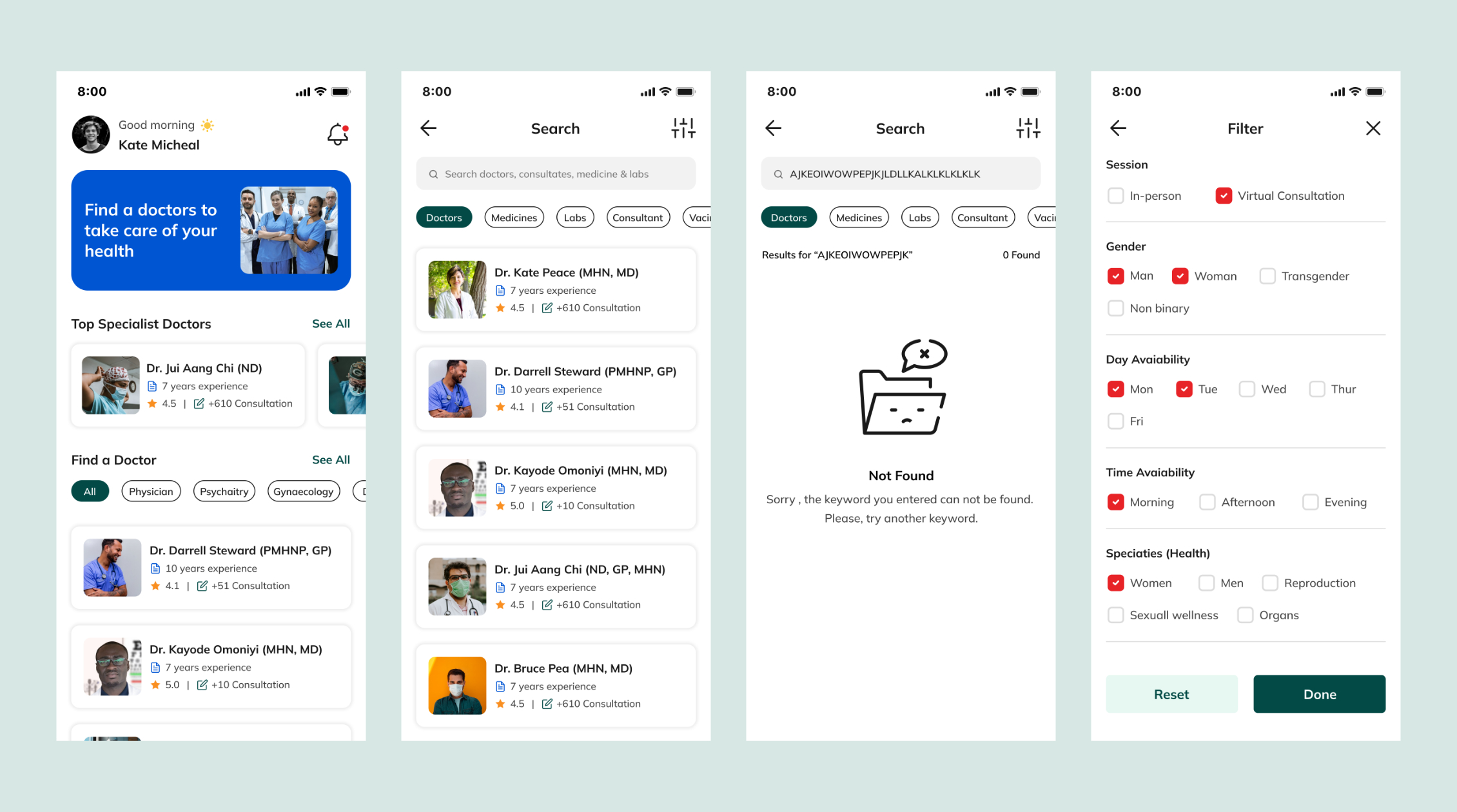
Personalized search experiencewhen searching for doctors. The search filter is tailor-made to cater for a variety of individual requirements. The search results are designed to be informative doctor pictures, years of experience, short descriptions and CTA buttons to explore the complete profile or book an appointment.
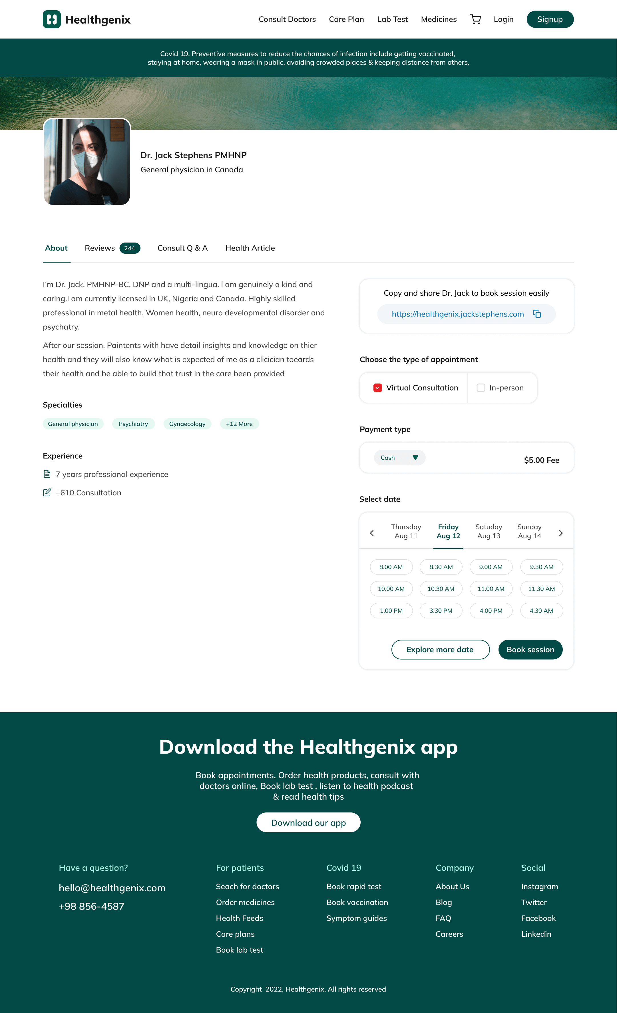
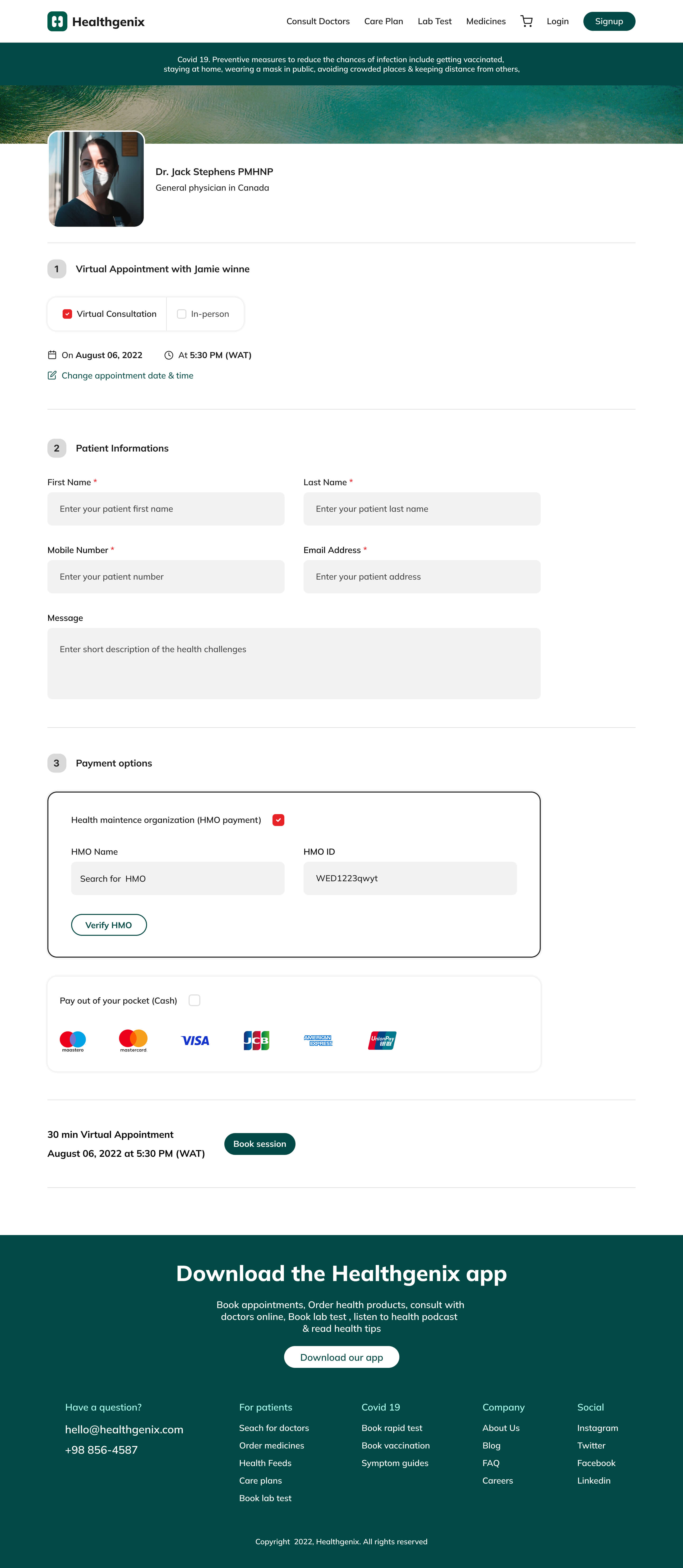
Booking a doctor's appointment needs to be straightforward. I had this in mind when designing the solution. A simple toggle button to pick the type of appointments (Virtual or In-person), a simple calendar to choose the prefered date and time, a flexible payment method with multiple options (HMO, Cash, Card )

The Healthgenix app will not only provides more convenient access to healthcare but also supports better health outcomes and increased patient satisfaction. By reducing wait times and making specialist consultations available remotely, we enabled patients to manage their health more effectively. This, in turn, leads to more satisfied users, reduced self-medication, and fewer unnecessary in-person visits
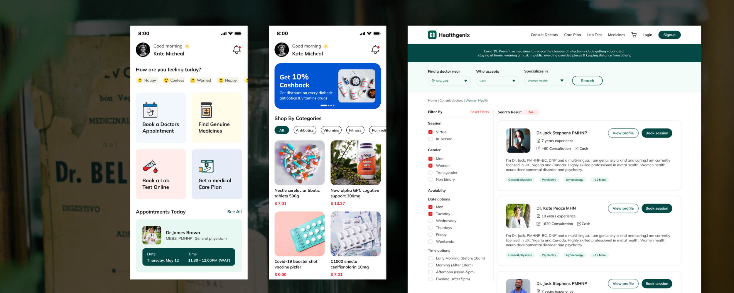
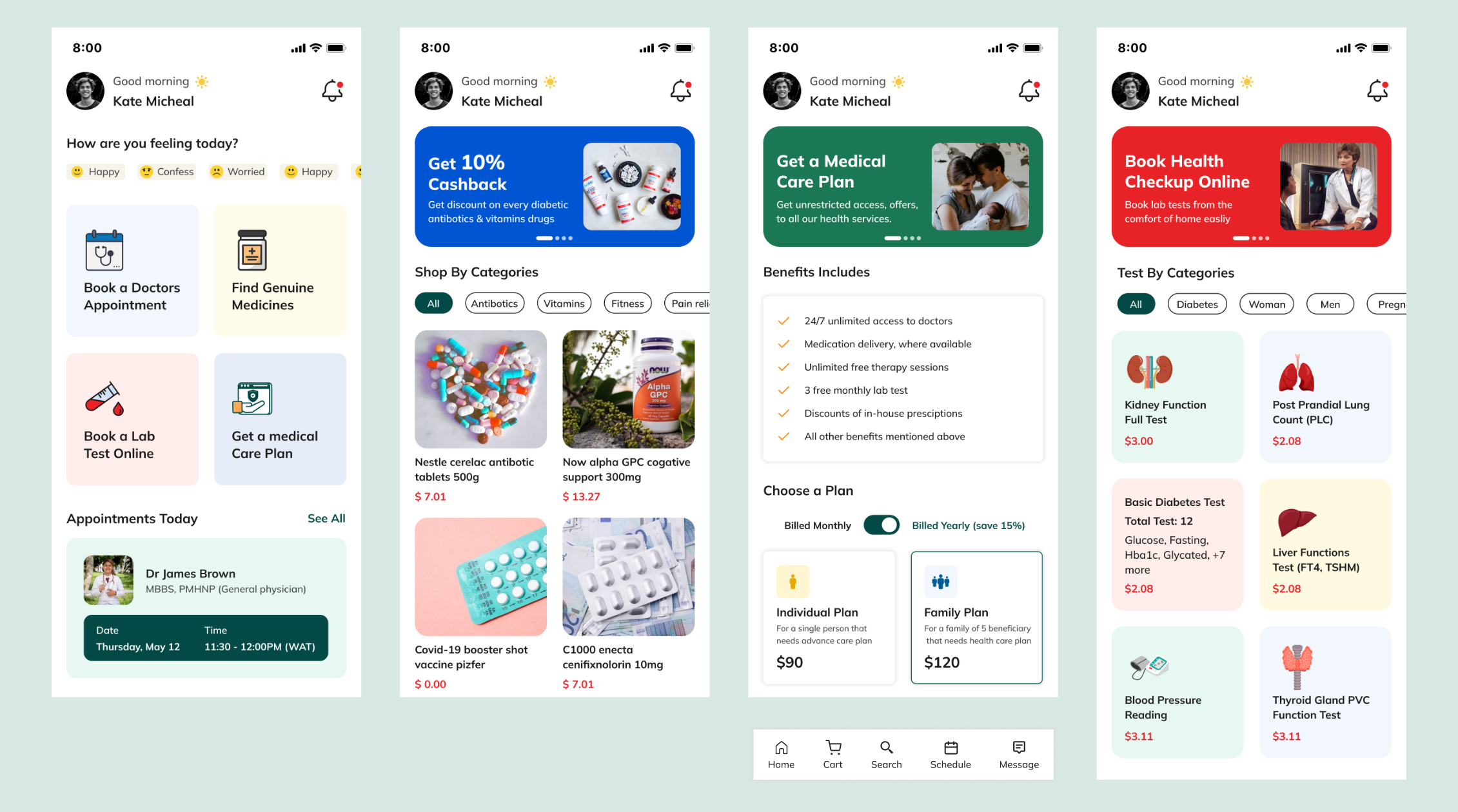
The mobile approach is the same as with the web variant. My proposition is to put the users at the focus of my design decisions. From user flow to page interactions and page layout. All this design decision is to make the mobile app design of healthgenix user-friendly and helpful.
Home page, Pharmacy page, Care-plan page & Lab page
Doctor's page, Doctor's Search page, Search Empty State Page & Doctor's Filter
Doctors profile page, Appointment page, Users/Paitents notification page, Users/Paitents profile page

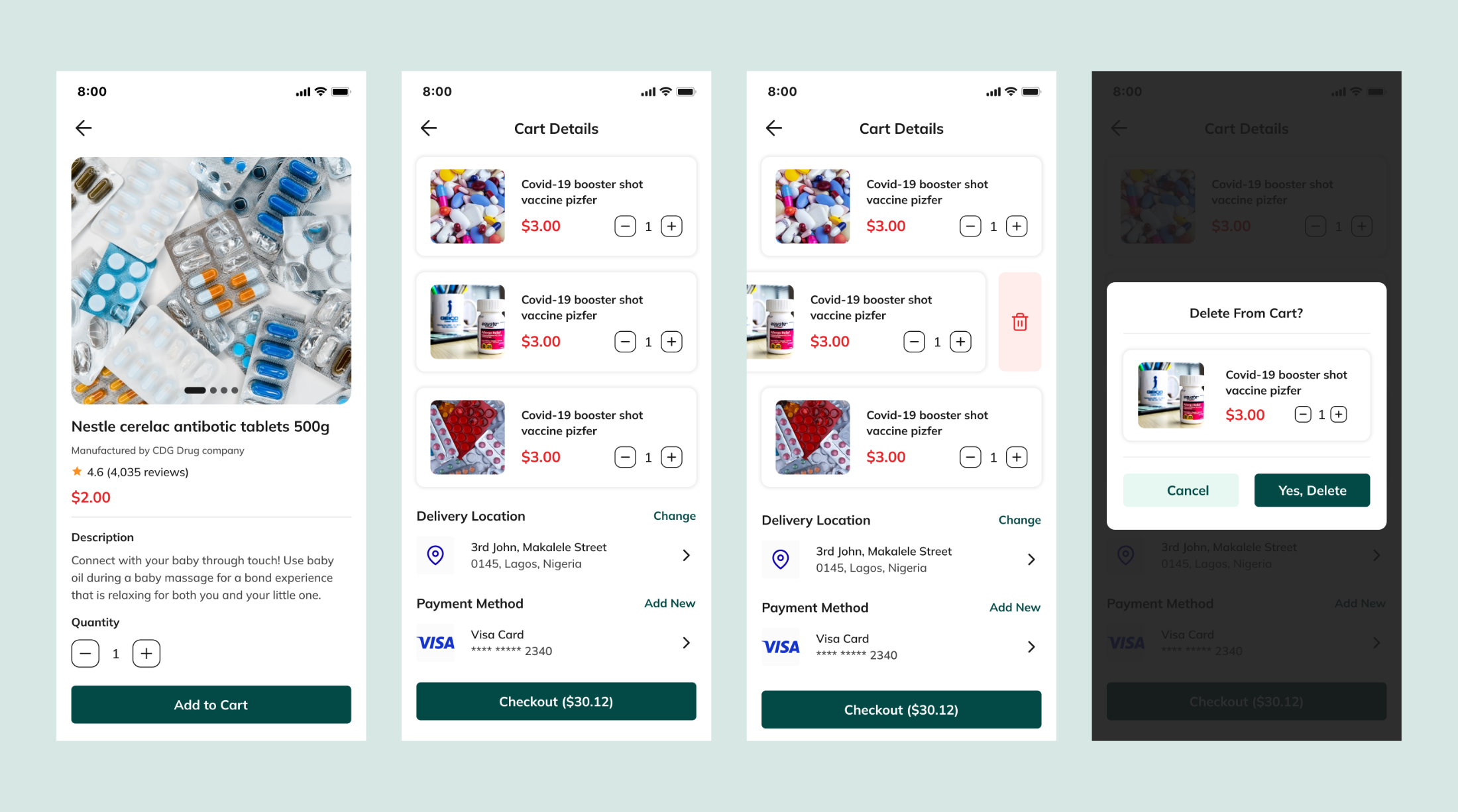
Product page, Cart Details, Product delete instance page, Delete confimation page
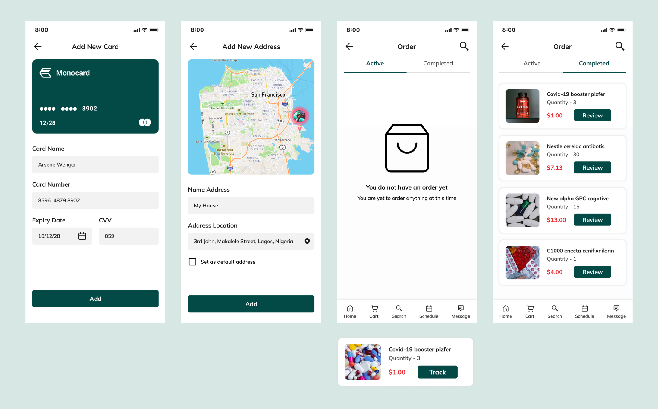
Add new card page, Add new address page, Order page active empty state (Active card allows tracking of order), Completed order page (With review)
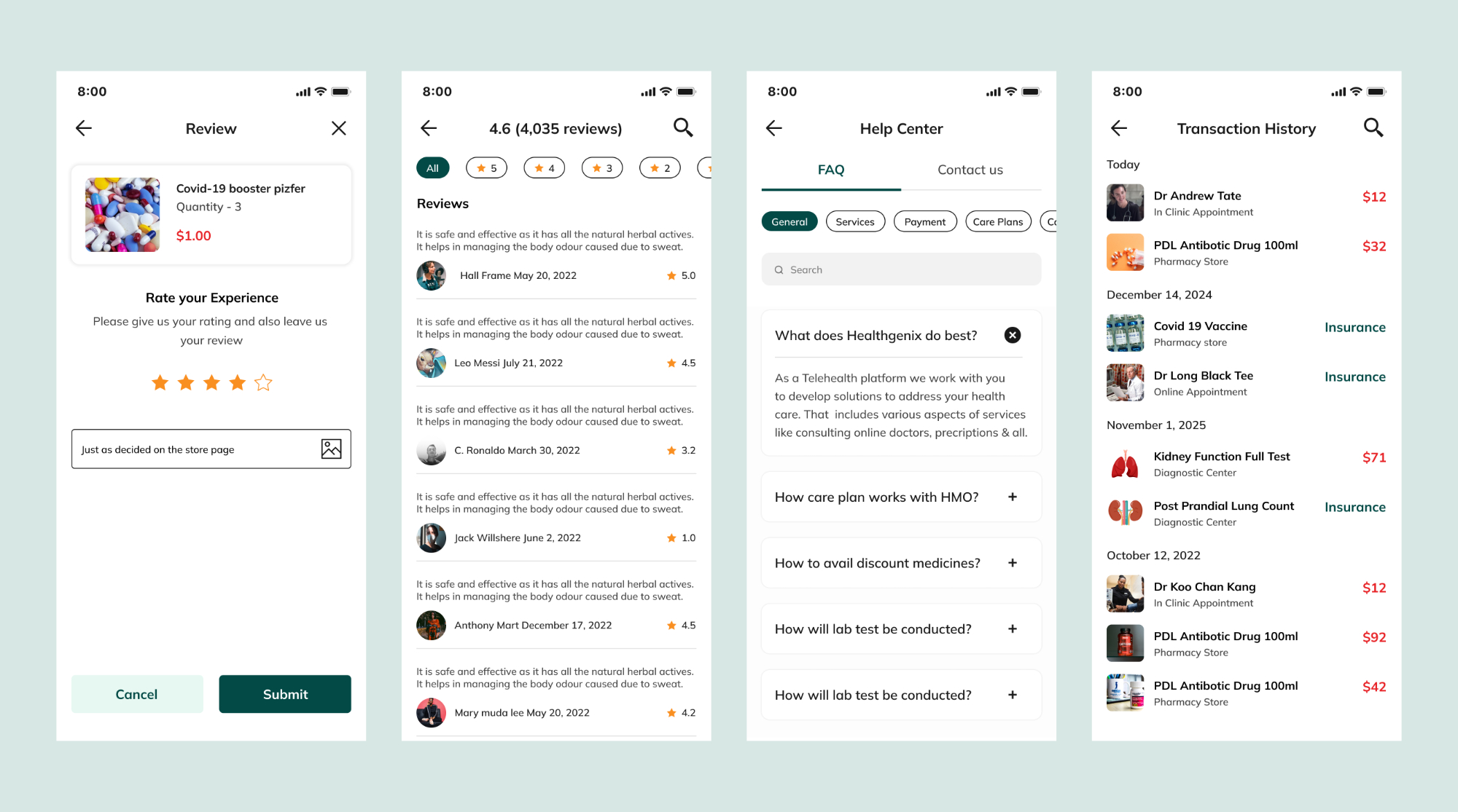
Review page, Help center page, Transaction history
