Personal design exercise to redesign a podcast app I use daily.
2020 - 3 weeks
Mixlr is a simple way to share live audio online. Broadcast using any source and invite people to listen and chat in real-time
Mixlr is Professional live audio that allows users to listen and broadcast audio. Mixlr’s mobile UI experience faced several challenges, including an outdated interface, unintuitive navigation, and limited interactivity. I personal found it difficult to discover content, navigate between features, and fully immerse myself in the experience of live audio. The goal was to simplify these touchpoints while maintaining a clean, visually pleasing design that myself & users would enjoy spending time on.
This case study is for "The Listen" Part of Mixlr that is free for life for end users

To make informed design choices, I developed detailed personas based on insights from a diverse mix of Mixlr’s core and long-time users, ranging from close friends to online acquaintances, casual listeners to professional broadcasters. As a designer and daily Mixlr user, I had personally experienced some of the app’s limitations and wanted to validate whether these pain points were unique to me or shared by others. Through research and persona development, I found that many users faced similar challenges, each persona capturing unique needs, goals, and pain points. This guided feature prioritization and interface design to better meet the expectations.

In designing Mixlr's interface, I implemented a style guide that delivers a sleek, cohesive look aligned with the platform’s creative, community-oriented identity. Choosing the Satoshi font family allowed me to strike a balance between readability and a modern aesthetic, ensuring a welcoming feel throughout. The calming, balanced color palette featuring deep blues and soft neutrals was designed to be easy on the eyes, creating an atmosphere ideal for prolonged listening sessions.

Aside from the UI that needs to be improved, Mixlr is a straightforward and easy-to-use app. I think it follows the 3-click UX Rule ( Heuristic principle that says that no page should take more than 3 clicks to access - ( That's if you add the channel/podcast you listen to Following page "Favourite page")
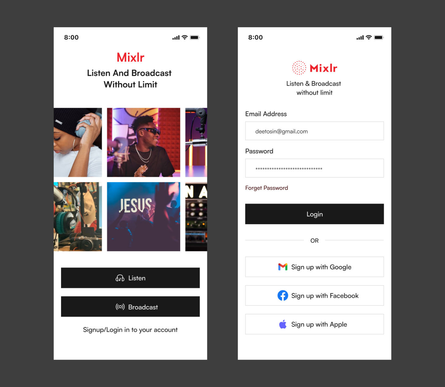
The UI Redesign design approach I take here is to keep the ease and straightforwardness of the app and improve the UI. The Tagline/Slogan comes in handle here onboarding users in a first-look tour approach and accompanied with images which is a powerful way to capture users' attention (Elaborating the Slogan "Listen & Broadcast without limit")
The onboarding Tagline and image can be used by Mixlr to advertise features, channels and a lot more. "It also allows user to Perform actions like Listen or Broadcast or Login/Signing - Mixlr enable users to listen without registering (A year plus without registering "No ability to chat through")
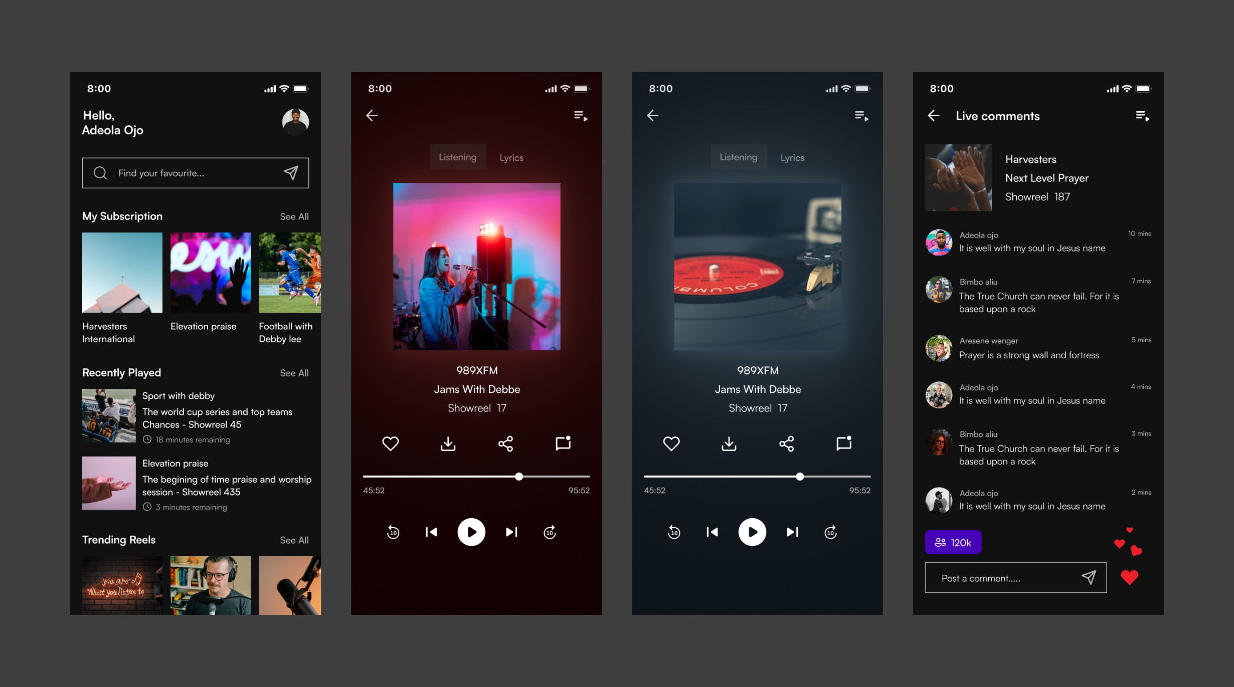
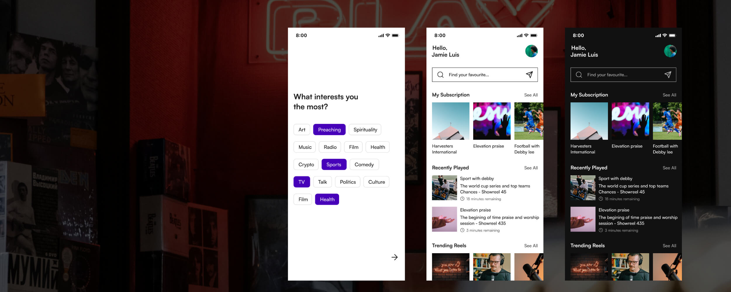
Homepage - The homepage redesign here helps offers users options for creating a more personalised experience while using the app. Returning users can easily see Channel they subscribe to and can also jump back to listening to recently played podcasts/channels.
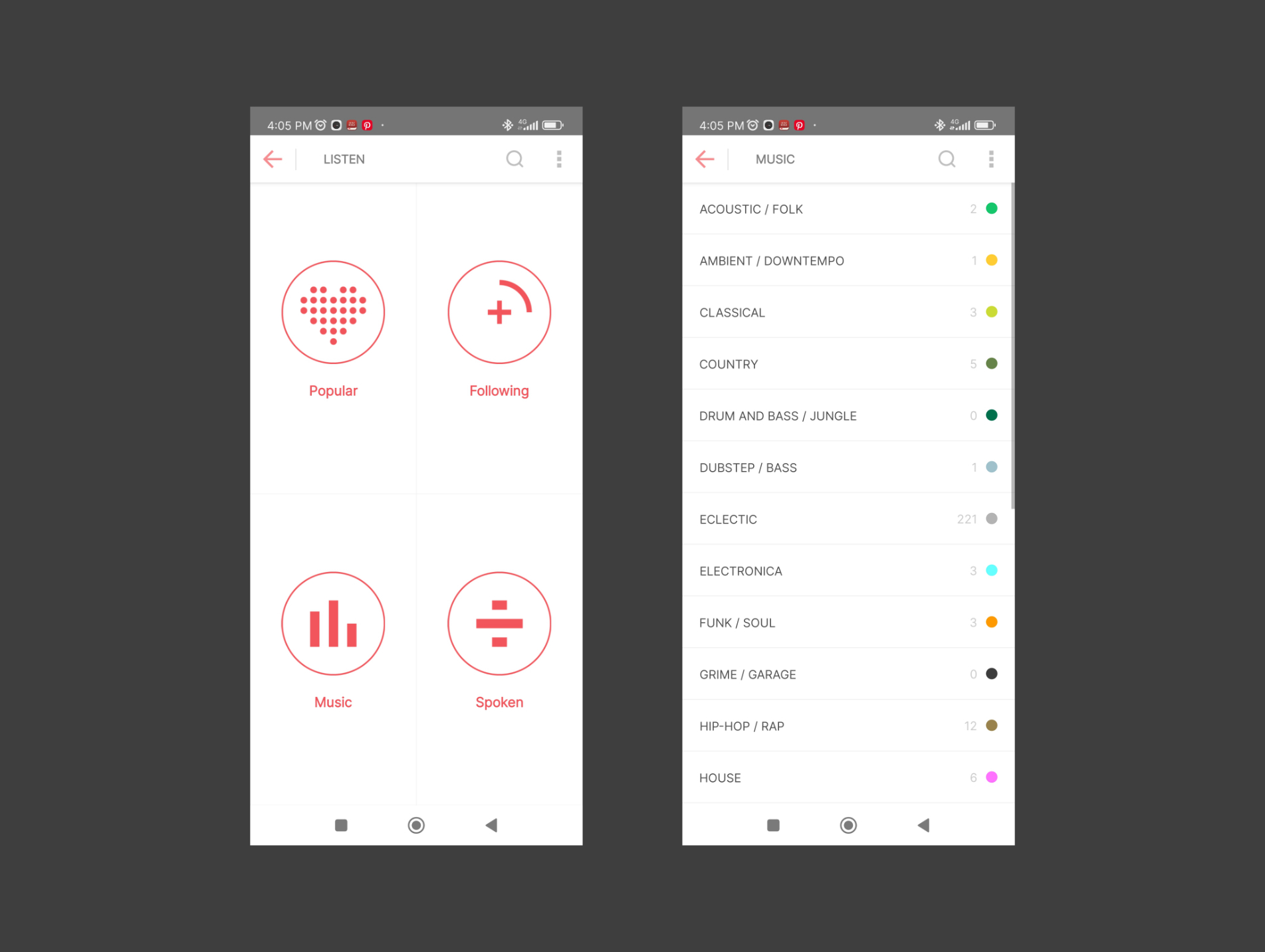
Discovery page - This helps users explore the overwhelming amount of channels/podcasts on Mixlr. Added Tags to help user filter and explore - this is critical on a mobile interface where limited screen real estate requires different approaches.
Interest page - New users are shown the interest page after registering where they can select what interests them. This is used to curate their homepage.

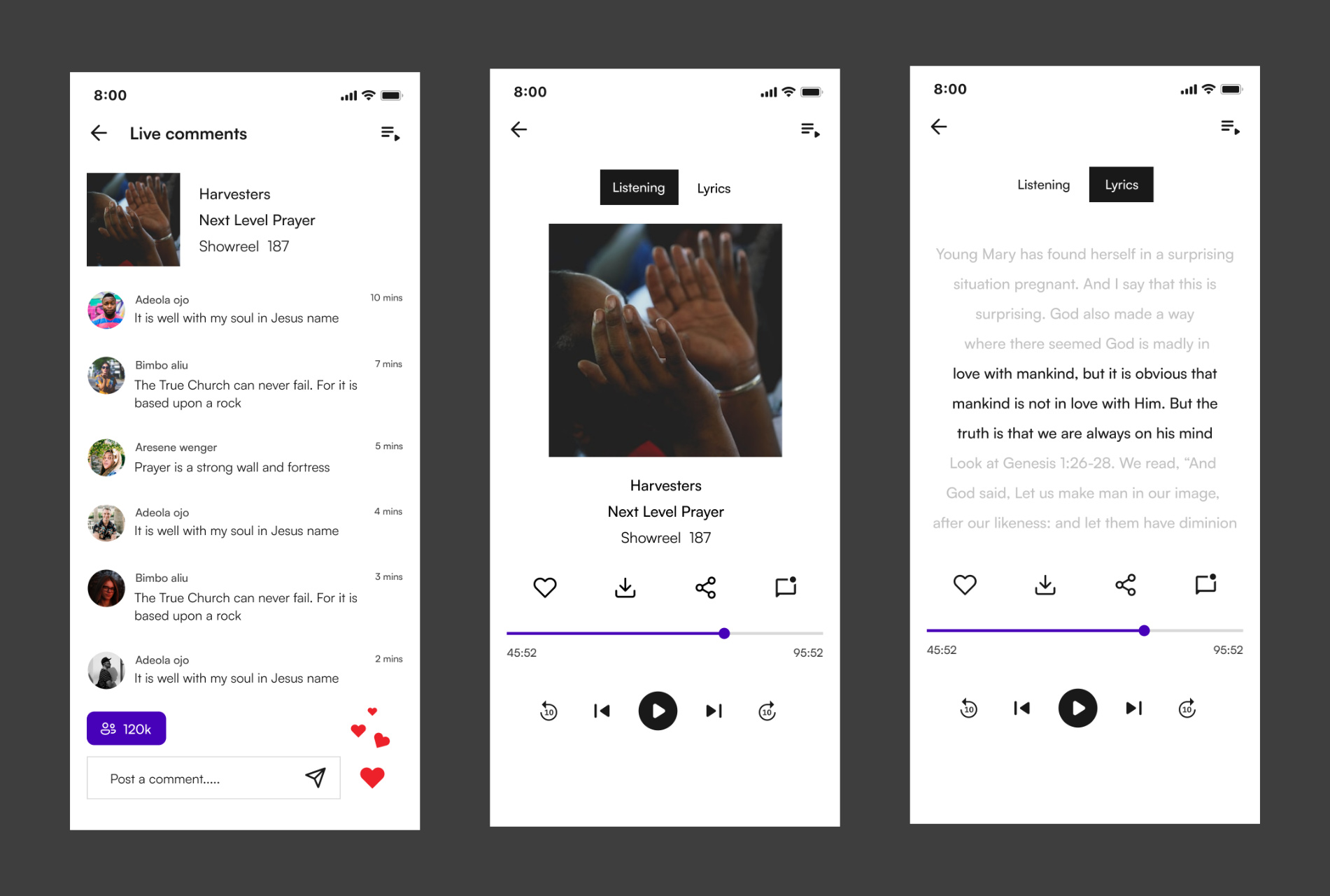
Now listening page - The Now listening page provides users with options like pause, play, rewind, forward, chat, download, share and like. Additionally, this page can be minimized to allow users to view other screens while listening to audio content.
Lyrics/Caption page - Accessibility Aid for deaf and people with hearing difficulties.

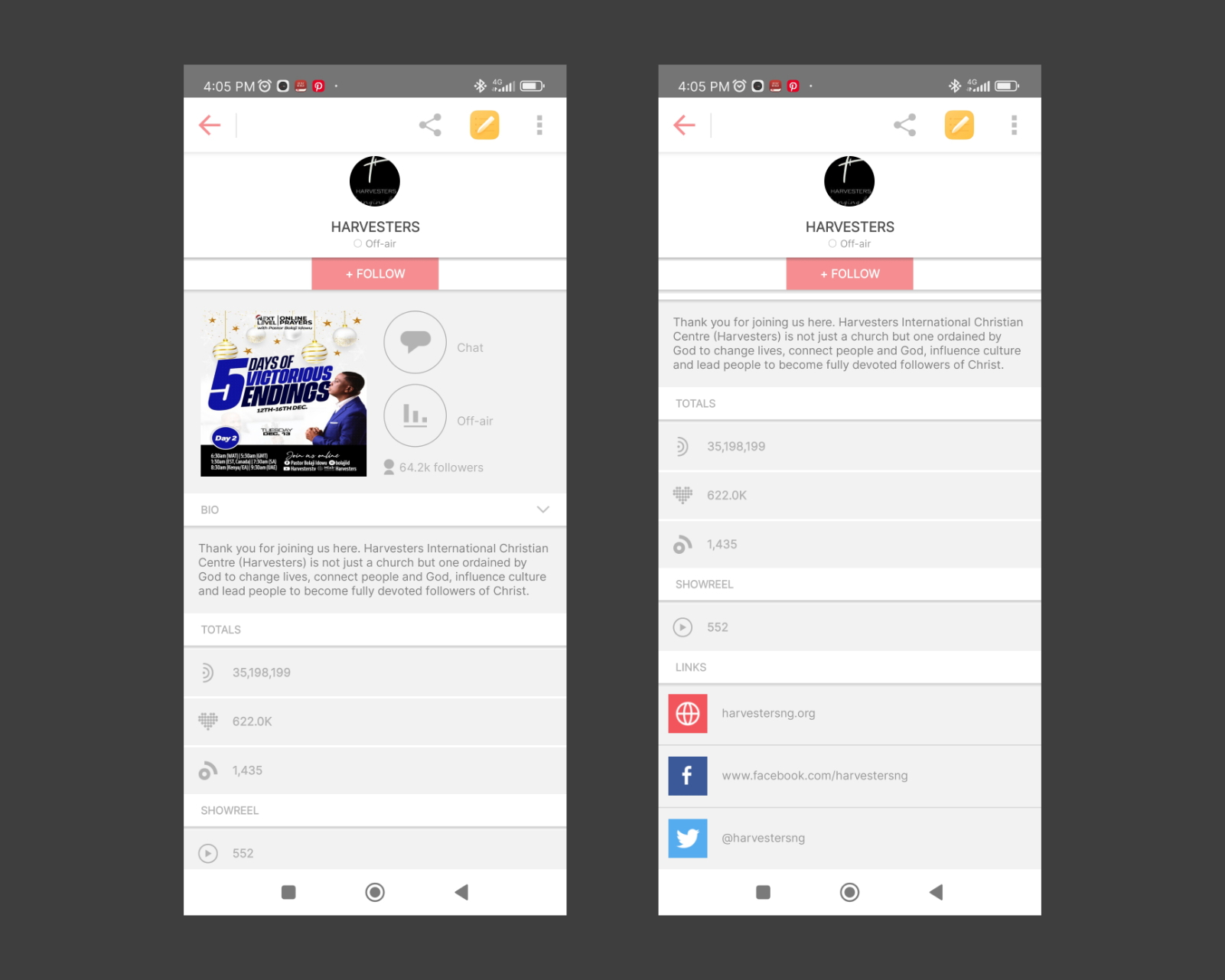
Channel/podcast page - The redesign here helped declutter information overload by simplifying and grouping relevant information to create a good user experience interface.
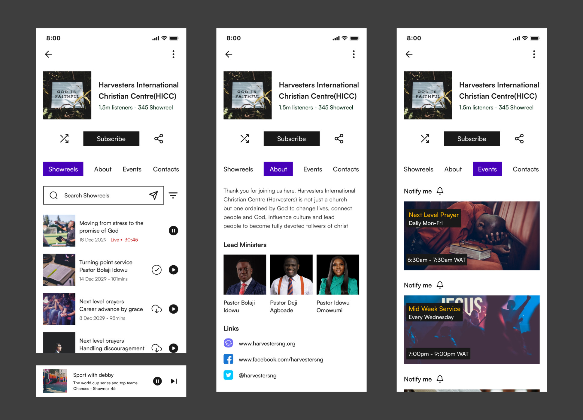
The Showreel - Session of the app contains archive/past shows of the session of the published channels that broadcast. " Harvesters, for example, have 300+ " Using Infinite scroll without the ability to filter by (Months, days, Weeks) or the search box is bad UX which the redesign corrected.
The Event page - Designing a dedicated event page allows channels and users to communicate better. Channels/Podcasts can communicate upcoming events and users can explore events and click notify to be notified when the events begin.
The About page - Detailed insight/story into the channel/podcast
The Mixlr Mobile App redesign was a transformative project that leveraged existing UX research principles, creative problem-solving, and strategic thinking to bring a fresh, streamlined experience to users. As a designer, this journey reinforced the impact of empathy-driven design, thoughtful aesthetics, and clear communication, ultimately making Mixlr better in the competitive world of audio streaming.